In the culinary world, presentation is everything. It’s not just part of the meal. It is the meal’s first and most persuasive argument.
Imagine the difference between a fancy Michelin-starred restaurant and a lively food truck. Both offer amazing food. But one offers an experience, an identity, and a story you want to be a part of.
This isn’t about throwing a fork on a napkin. It’s about creating a visual language that makes people hungry before they see the menu. Think of the bold intensity of Gordon Ramsay versus the calm of Ina Garten.
So, what’s your visual style? Is it about artisan craftsmanship or accessible artistry? Your logo, colors, and photography are more than decorations. They’re your cultural commentary on a plate.
This guide is your blueprint. We’ll explore beyond basic food branding. We’ll dive into culinary identity, where every color and camera angle makes your work a statement.
Components of Visual Branding
Think of your visual identity as a pantry full of ingredients. Each one is important. You wouldn’t serve a meal with just salt and pepper, right? So, why build a brand with just a logo?
Your visual identity has four key parts. First, your logo is like your brand’s face. It’s the first thing people see. Next, your color palette is like your brand’s clothes. It shows your brand’s mood, whether it’s modern or earthy.
Then, there’s typography, or the font on your menu. It speaks before anyone reads the menu. Lastly, your photography style shows your brand’s personality. Is it dramatic or friendly?
But most chefs stop here. The best Marketing & Branding teams know there’s more. They have ten key brand assets.
Let’s look at the full list:
- Logo: Your brand’s crest
- Website: Your digital home
- Brand Messaging: The story behind your dishes
- Product Packaging: How your food travels
- Brick & Mortar Shops: Your physical space
- Social Media: Your daily chat
- Email Marketing: Your personal invite
- Advertising: Your broadcast system
- Content & Influencer Marketing: Letting others share your story
- Merchandise: When people want to wear your brand
Each element adds to your brand’s world. The feel of your packaging, the look of your dining room, and your Instagram filter all speak the same language. They should match.
This isn’t about being fancy. It’s about being consistent. When Thomas Keller’s French Laundry feels like a tailored suit and Anthony Bourdain’s brand feels like a worn leather jacket, it’s not by chance. Every choice, from website design to menu layout, builds your brand’s personality.
So, are you building a toolkit or just collecting pretty things? The choice shows if you’re running a kitchen or building a legacy.
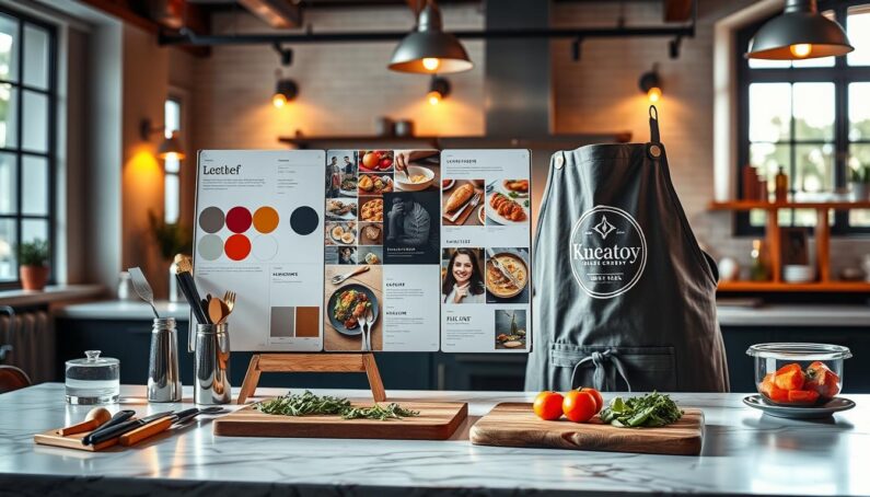
Designing Your Logo
Creating a logo for a chef is all about simplifying. You’re turning a big culinary idea into a small, powerful symbol. It’s not just for showing off a dish. It’s your mark in the food world.
Forget the busy logos of fast-food places. A great chef logo hints at something deeper. It shows the craft and care in the food, not just the food itself.
You have two main tools: the logotype and the brand mark. A custom wordmark can shout “artisan” without words. Or, a simple icon like a chef’s knife can be a strong brand mark.
![]()
Great designs often stick to the simple. They use empty space well. In a world full of noise, this quiet is the loudest statement. It shows you’re confident in your skills.
| Logo Type | Description | Best For | Iconic Example (Concept) |
|---|---|---|---|
| Wordmark (Logotype) | Focuses on stylized text, often in bespoke fonts. | Chefs with unique names or personal brands. | An elegant, custom-written surname. |
| Brand Mark (Symbol) | A standalone icon that represents the chef’s philosophy. | For a quick visual shorthand, like fire for grilling. | A simple chef’s toque or a perfect olive branch. |
| Combination Mark | Combines a wordmark and a symbol together. | For quick name recognition with a symbolic twist. | A custom knife icon with a modern chef’s name. |
Your logo choice is your first impression. It’s the start of your brand’s promise. For more on building your brand, see a complete guide for marketers. Your logo is your silent, loyal ambassador. Make every detail count.
Choosing Brand Colors
Your brand’s color scheme speaks directly to people’s emotions. It’s not just about looks; it’s a powerful way to communicate. Your chef brand colors can hint at the quality and experience you offer, even before someone reads your bio.
Warm colors like reds, oranges, and yellows are key. They make people think of food and can even make them hungry. Red, in particular, is linked to increased heart rate and hunger. Orange and yellow add warmth and energy to your brand.
But if your brand is more about earthy things, like organic food, you’ll want different colors. Natural tones like mossy greens and rich browns can suggest freshness and quality. These colors don’t shout; they reassure.
Blue is often avoided in food branding because it’s rare in nature and can look like mold. But a cool blue against warm colors can be a bold choice. It shows precision and calm.
Your color scheme sets the mood for your brand. Do you offer cozy comfort or sleek luxury? A deep burgundy with matte black suggests luxury, while bright citrus tones are perfect for casual food.
To use color psychology in your branding, think about families and what you want to say. The table below shows the main color palettes for food brands.
| Color Family | Psychological Effect | Ideal For Culinary Brands |
|---|---|---|
| Warm Palette (Reds, Oranges, Yellows) | Stimulates appetite, creates excitement, evokes warmth and energy. | Bold, flavor-forward concepts; fast-casual eateries; brands focusing on spice, citrus, or comfort food. |
| Earthy/Natural Tones (Greens, Browns, Beiges) | Promotes feelings of health, organic quality, rustic authenticity, and wholesomeness. | Farm-to-table restaurants, organic product lines, bakeries, coffee roasters, and sustainable food brands. |
| Cool/Accent Colors (Blues, Slates, Purples) | Can suppress appetite but conveys trust, calm, and modernity when used sparingly. | Best as secondary colors or accents for seafood concepts, artisanal brands wanting a clean, modern edge, or tech-forward food services. |
When choosing colors, think about what story they tell. Do they match your ingredients and values? Your colors are a promise to your customers’ subconscious. Make it a promise worth keeping.
Consistency in Visuals
Why do customers feel at home in a chef’s restaurant, Instagram feed, and cookbook? It’s because of omnichannel branding. This visual language is spoken across every platform. It’s what separates the pros from the amateurs.
Think of your visual identity as an orchestra. Your logo is the conductor, your colors are the strings, and your photography is the woodwinds. If they’re all playing different tunes, you get noise. But when they’re in sync, you get a symphony that people remember.
Take Momofuku or French Laundry. You can spot their dishes from afar. This isn’t by chance. It’s a deliberate strategy. A local bakery must match its website colors to its storefront. Celebrity chefs like Gordon Ramsay have a brand that’s consistent across all platforms. This brand cohesion is why he can charge high prices. It shows value and trust.
In your kitchen, your menu font should match your website and social media. Your brand’s colors should be everywhere, from your apron to your takeout boxes. This consistency is key.
Your photography style must be consistent. Your Instagram feed should preview the dining experience. This harmony turns a skilled cook into a commercial success. You’re not just selling food; you’re creating an experience.
Every touchpoint, from Google reviews to takeout foil, adds to your brand’s melody. When they all come together, you achieve brand cohesion. This is the heart of modern Marketing & Branding for chefs.
It’s the difference between a great chef and a household name. The former cooks a meal. The latter leaves a mark.
Tips for Food Photography
Forget the cliché avocado toast overhead shot—today’s chef photography demands the narrative depth of a feature film. Your plate is a stage. Every crumb, drizzle, and garnish is a character with a role to play. In the Instagram age, your food isn’t just sustenance; it’s the protagonist in your brand’s ongoing visual story.
This is where visual storytelling separates the pros from the amateurs. Is that herb sprig placed with surgical precision, or tossed with rustic abandon? The answer defines your culinary point of view. Your audience craves context. They want to feel the steam rising, imagine the crunch, and sense the story behind the meal.
Lighting is your most critical co-director. Harsh, direct flash is the villain in this tale—it flattens texture and kills mood. Seek soft, natural light. It sculpts shadows, highlights gloss on a sauce, and makes ingredients look alive. Think of it as cinematic lighting for your culinary star.
Composition is your script. The rule of thirds isn’t a rule; it’s a starting point. Place your main subject off-center. Use leading lines from a fork or a napkin to guide the eye. Create negative space. It gives the image room to breathe and focuses all attention on your creation.
Amateurish shots are the quickest way to sink your social media visuals. A messy background, a dirty fork in frame, or a blurry focus tells a story of carelessness. Your feed is a curated gallery. Every post is an audition for your audience’s follow—and their loyalty.
Don’t ignore the power of short videos. A six-second clip of cheese pulling or caramel cracking is visceral. It engages more senses than a static image. This motion is a potent tool in your visual storytelling arsenal, giving a behind-the-scenes glimpse that photos alone cannot.
Your aesthetic must be consistent. Is your brand a minimalist sonnet in beige and cream? Or a loud, joyous poem in saturated color? This consistency builds recognition. When someone scrolls past your photo in a crowded feed, they should know it’s yours before they see your name.
| Photography Element | Common Amateur Mistake | Professional Solution | Impact on Brand Perception |
|---|---|---|---|
| Lighting | Using on-camera flash or uneven overhead light. | Utilize diffused natural light or a softbox. Shoot during “golden hour.” | Creates depth, texture, and a premium, appetizing feel. |
| Composition & Styling | Cramped frame, no focal point, distracting props. | Employ the rule of thirds, use strategic negative space, and choose 1-2 relevant props. | Communicates intentionality, sophistication, and clarity of vision. |
| Color & Consistency | Inconsistent color grading; filters change with every post. | Develop a preset or edit style and apply it uniformly across all social media visuals. | Builds a strong, recognizable brand identity instantly. |
| Narrative & Point of View | Generic, top-down “food catalog” shot. | Shoot from multiple angles (45-degree, eye-level) to create a sense of scene and story. | Transforms food into an experience, fostering emotional connection and engagement. |
Look at the masters. Christina Tosi’s Milk Bar uses a playful, slightly chaotic, and brightly lit style. It feels approachable and fun, like dessert should be. Moon Juice opts for a clean, zen-like, and pastel-heavy aesthetic. It visually whispers “wellness” and “purity.” Their food styling is an extension of their brand manifesto.
Ultimately, chef photography is not vanity. It’s your silent, 24/7 salesperson. A stunning, story-rich image convinces a scroller that your culinary world is one they need to inhabit. It’s the most delicious marketing you’ll ever do.
Hiring Professionals vs. DIY
Choosing between a pro and DIY branding is more than looks; it’s a smart money move. Think of it like choosing the right tools for your kitchen. You wouldn’t start a restaurant with a bad knife and a small stove. So, why start a brand with amateur photos?

The DIY way is like making an indie film in Marketing & Branding. It’s personal and can be great if you have a good eye. But, it takes a lot of time. Hours spent on design or perfecting photos are hours not spent on your business.
Hiring pros is like making a big-budget movie. It’s an upfront brand investment that gets you quality, speed, and a polished look. This isn’t just about looks; it’s about value. Restaurants with strong branding get bigger checks, and celebrity chefs’ brands are worth millions.
When deciding, ask yourself: what’s your time worth? A pro can make a logo in a week, while you might take a month. A pro photographer can capture your story instantly, unlike your smartphone photos.
Here’s a comparison:
| Factor | DIY Approach | Professional Hire |
|---|---|---|
| Upfront Cost | Low (software subscriptions, your time) | High (agency/designer fees) |
| Time Commitment | Very High (learning curve, execution) | Low (you provide direction, they execute) |
| Strategic Depth | Limited (your own perspective) | High (market research, competitor analysis) |
| Long-Term ROI | Uncertain (risk of inconsistent quality) | High (cohesive brand justifies premium pricing) |
| Scalability | Difficult (assets may not be versatile) | Built-in (brand systems are designed to grow) |
DIY is good for a personal brand. But, your font shouldn’t be Comic Sans, and your photos shouldn’t look like they were taken in a cave. Sometimes, spending money is the smartest move.
Professional PR and social media aren’t myths. They’re investments. You’re paying for their audience and expertise. This brand investment turns your visuals into an asset.
So, should you DIY or hire pros? It depends on your goals. DIY is fine for a small following. But, for a big brand, Marketing & Branding is essential. Your cost-benefit analysis should look at the long-term value, not just the cost.
Conclusion
Your visual brand is like the last thing you clean at night and the first thing you grab in the morning. It’s not just a side dish. It’s the heart of your professional identity. We’ve covered everything from logo design to the perfect shot of your dish. Now, it’s time to act.
This journey in Marketing & Branding reveals a key truth. You’re crafting a brand legacy, not just a menu. With everyone having a camera and opinions, your thoughtful visual strategy sets you apart. It turns a simple dinner into a memorable experience.
The world is changing fast. The next big thing in chef branding isn’t just about looks. It’s about being true to your audience. It’s about showing your commitment to sustainability. It’s about exploring new tech like VR for kitchen tours or AI for color analysis. Your visual strategy needs to be as quick and adaptable as your cooking.
So, get ready to work. Design with the passion your dishes deserve. Let every element of your visual identity tell your story. Create a brand legacy that’s visible before anyone takes a bite. The canvas is ready. Now, let’s make it unforgettable.